
#24 Is Your Website Written in Magical Invisible Ink? Why Color Contrast Matters
Start of Mini-Series: Building an Accessible Website (Even If Tech Isn’t Your Thing).
The next few blogs are going to be all about how to make your author website accessible so you don’t leave any readers out!
So remember when we spent time choosing brand colors that felt like you—maybe rich purples, soft lavenders, or bold teals? And remember how we made sure they weren’t just pretty, but also accessible?
(If not, no worries! You can check out the post here: How to Check if Your Colors Are Accessible.)
Well, it’s time to put those colors to work! When you’re building your website, it’s not just about making it “look good.” It’s about making sure everyone can read and interact with it comfortably—including people with visual impairments, color blindness, or just tired eyes (we’ve all been there).
You don’t want to accidentally use invisible ink that only some readers can see. 😬
What Is Color Contrast (and Why Should You Care)?
Color contrast is the difference in brightness between the color of your text, links, buttons, or other important info and the background behind it. If the contrast is too low, your content gets hard—or even impossible—to read.
To ensure the highest number of readers can see and understand your content: Make sure every piece of information—like text, links, or buttons—has enough contrast against the background it's sitting on.
This isn’t just a suggestion—it’s one of the most important pieces of web accessibility. And the good news? It’s easier to check than you think.
How to Check Color Contrast
Take the hex color codes for your chosen brand colors and use one of these tools to make sure they have sufficient contrast against each other and whichever website background you chose:
Where Contrast Matters (and What to Look For)
Let’s break it down with some examples so you know what to check as you build or update your site.
1. Body Text + Background
Your main paragraphs should be easy to read without squinting. Think dark text on a light background or vice versa.
Good example: Either a purely black font or a dark color is best for readability against a white background. Or, choose a very light font color if your background is dark.
Bad example: See how hard it is to see this text?? Or this one??
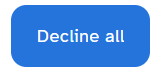
2. Buttons + Background + Button Text
Readers need to be able to see your buttons against your website’s background. They also need to be able to read the text within the button against the button’s color. Make sure someone can easily see the button and read what it says by ensuring the button color, text, and website background all have sufficient color contrast against each other.
You want them to be able to see that preorder link, right??
Good example:

Bad example:

3. Links + Background + Link Text
If a link is a different color, it needs to stand out from the regular text AND be readable against its background.
Good example: Notice how I’ve chosen a bright blue color for my links. This color has enough contrast against my white website background AND the black text I’m using for my regular paragraph font.
Bad example: This link color is not distinct enough from the regular paragraph font, so some readers might not be able to tell it apart from the regular paragraph text.
4. Headings + Background
Bigger text (like headings) can have slightly less contrast than small text, but it still needs to be clear and easy to read.
To make your life easier, just choose one or more of your brand colors that you know has enough color contrast against your chosen background. Then, you know most people can will be able to see and read your headings.
5. Hover Colors + Background + Text
When someone hovers over a button or link, the color might change. Make sure the hover version still has enough contrast.
Good example:

The button before you hover over it.
The button after you hover over it.
Bad example:
The button before you hover over it.

The button after you hover over it.
A Few Exceptions
You don’t need to worry about contrast for:
Purely decorative elements.
Example: background images, ornamental flourishes, purely stylistic shapes.
Elements that are disabled and not meant to be interacted with.
Example: A grayed-out button that can’t be clicked yet.
Your logo (but why not make it accessible with sufficient color contrast if you haven’t had one designed yet?).
Invisible or hidden text that is only meant for screen readers.
Tools That Make This Easier
Earlier blog post: How to Check if Your Colors Are Accessible
Many website builders now highlight contrast issues for you! Look up any built-in accessibility checkers and see if you have any color contrast issues hiding in your site.
One Other Note Regarding Color Blindness
When choosing your link, button, heading, etc. colors, you need sufficient color contrast, but you should also avoid problematic color combinations, like:
Red and Green (the biggest one to avoid)
Green and Brown
Green and Blue
Green and Gray
Green and Black
Blue and Gray
Blue and Purple
That way, people who have different types of color blindness can still tell the difference between your paragraph text, website background, and elements (like links, buttons, etc.).
Need to Do Next:
Test all your site colors using a contrast checker
Check buttons (background and text), links, headings, and hover colors
Adjust anything that doesn’t have sufficient contrast
Try a “colorblind simulator” to double check visibility
For example, Firefox has an extension: NoCoffee – Get this Extension for 🦊 Firefox (en-US), which you can use to view your website with various color blindness filter types to see if you can still see and read your content.
💬 Let’s Talk!
Which part of checking your site’s colors felt most confusing—or satisfying? Got a color combo that surprised you by not working? Drop a comment!
And if you’re building your site one accessible step at a time, subscribe to my newsletter for more friendly, no-jargon tips.