

Indie Publishing (While Chronically Ill)
A How-To, Maybe-Do-This, Oops-Definitely-Don't Do That Survival Guide

#35 Flashing or Autoplay Content on Your Author Site? Tread Lightly
Some people are sensitive to flashing lights (risk of seizures), disoriented by motion (especially with sensory conditions), or find autoplay audio unexpected and startling…

#34 Try This: Keyboard Navigation (Because Some Readers Can’t Use a Mouse)
Keyboard navigation lets people move around websites using only the Tab key (plus Enter, Space, etc.)—no mouse required. It’s essential for folks who can’t use a mouse, are keyboard users, or use assistive tools…
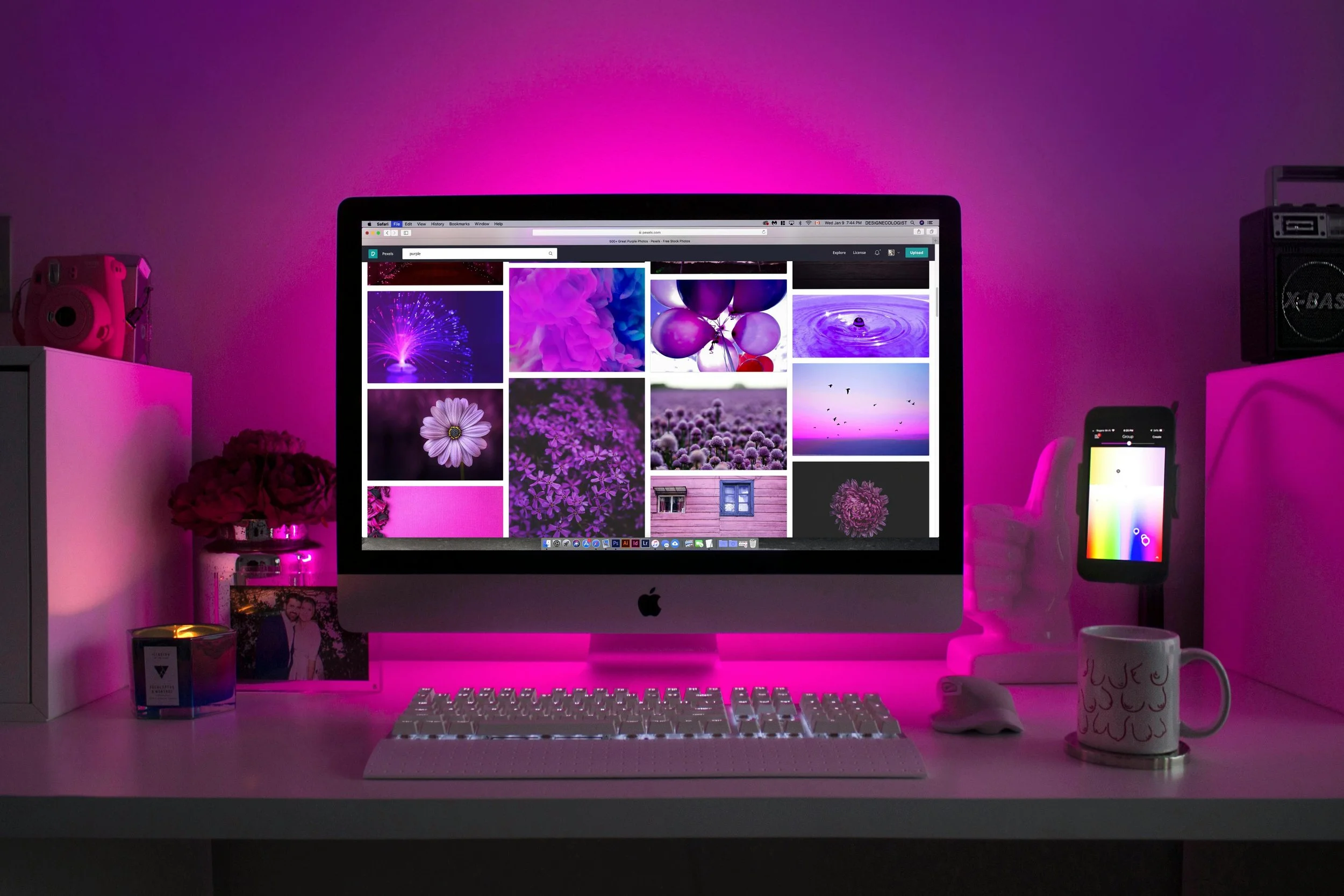
#33 Why Responsive Layouts Are Your Author Website’s Best Friend
A responsive layout is a website design that adjusts itself depending on whether someone is on a phone, tablet, or desktop. Think of it like a storybook that re-sizes itself to fit your reader’s hands…

#32 Writing Clear Link Text for Accessibility
Here’s the thing: if you’re still using links that say “click here” or “more”… that’s a trap. (Not a magical one, just a confusing one, especially for people using screen readers.)

#31 Your Page Titles Need a Purpose (Not Just a Vibe)
You know those little titles that appear at the top of your browser tabs? Or the thing a screen reader reads first when someone opens your website? That’s your page title…
#30 Headings Aren’t Just Pretty Titles: Why Heading Order Matters for Accessibility
Think of your headings as the chapter titles and subheadings in a story. If they’re out of order, people get lost—and no one wants to be wandering around your "About Me" page like a confused character in the wrong fairytale…

#29 Making Links Stand Out (Without Relying on Just Color)
Let’s talk links. They’re one of the most basic parts of your author website. And one of the easiest to accidentally make inaccessible…

#28 STOP SHOUTING AT YOUR READERS: Use Sentence Case for Better Accessibility
Let’s talk casing—not the kind that holds swords or spells, but the way your letters are styled…

#27 Font Size Matters: Making Your Website Easy to Read
Let’s talk font size. Specifically, the size of your main body text—the part people read the most on your website. If it’s too small, readers might feel like they need a magnifying glass (or a special eyesight spell) just to…
#26 Choosing Accessible Fonts: Because Your Words Deserve to Be Read
So you’ve nailed your colors on your buttons, links, and headings—but what about your fonts?
The font you choose doesn’t just affect your site’s look; it plays a huge role in whether your content is easy to read or makes people (and magical creatures) give up halfway through your home page…
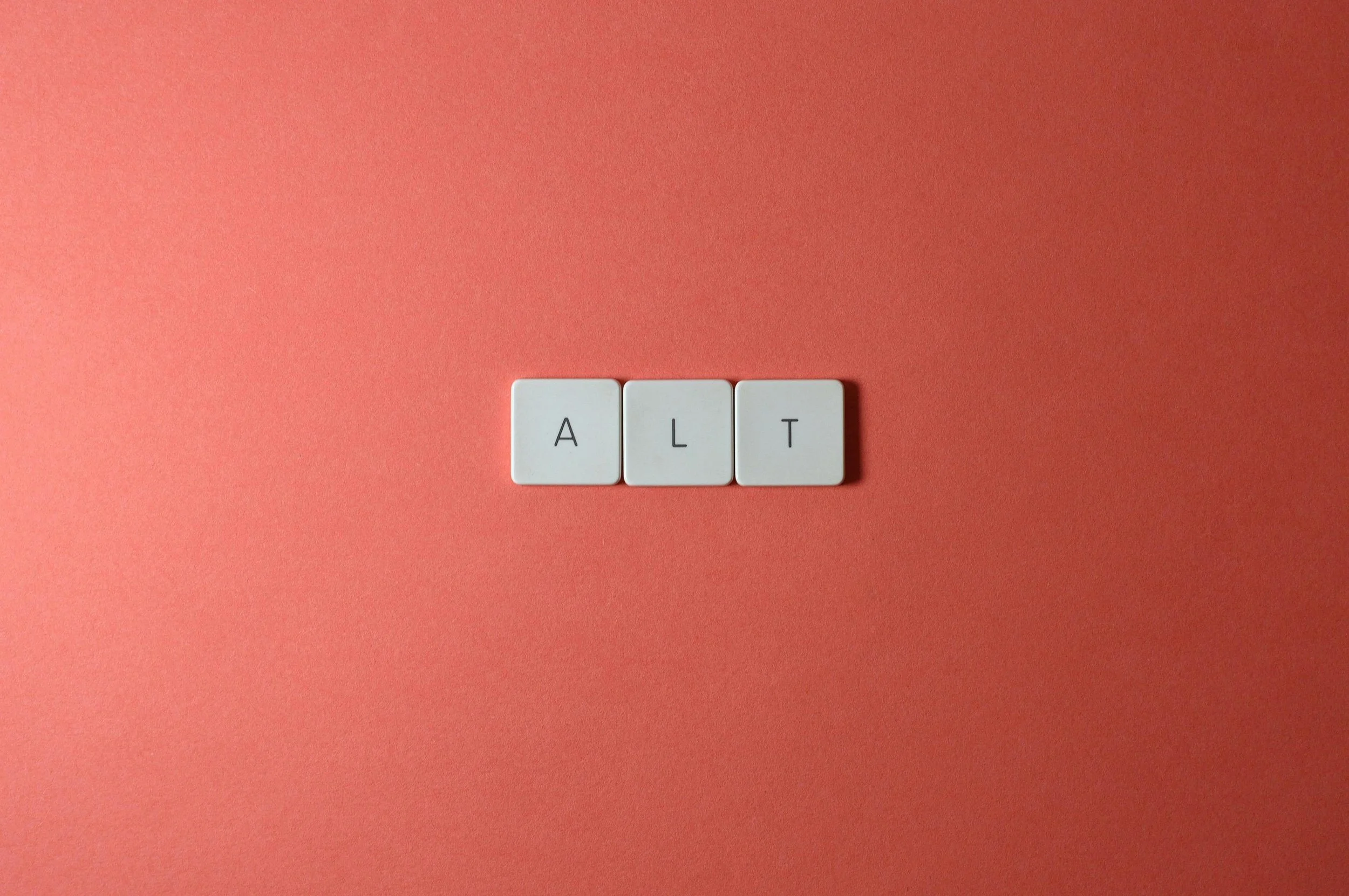
#25 What Good Is a Crystal Ball If No One Can Read It? Let’s Talk Alt Text
Let’s talk about something that sounds technical but is actually super simple and important: alt text.
Alt text (short for “alternative text”) is…

#24 Is Your Website Written in Magical Invisible Ink? Why Color Contrast Matters
So remember when we spent time choosing brand colors that felt like you—maybe rich purples, soft lavenders, or bold teals? And remember how we made sure they weren’t just pretty, but also accessible?
Well, it’s time to put those colors to work…

#23: How My Website Will Reflect My Brand
Designing an Author Website That’s Actually Accessible…

#22: Final Thoughts on Branding (And What’s Next)
Branding is an Evolving Process, and That’s Okay…

#21: Are Your Author Brand Colors Accessible??
The colors you choose for your author brand should also reflect the tone you’re going for, and the genre(s) you write in probably have some unspoken color associations with readers as well. Should you match?

A Little Less Invisible
One chronically ill girl.
Fae who feed on pain.
Being a snack just
got a whole new
meaning.

Cover
and
Release Date
Coming Soon!